Staring at white-ish paint chips wondering what on earth will work for your room or cabinetry?
White gallery-style walls have become abundantly popular lately, and whites have now made the jump back to the exterior of homes with the modern farmhouse look. And there’s always a question – what’s the best white paint or how to choose one? Whites and off-whites have been used by the design trade for decades to create a neutral backdrop for the many layered and textured elements implemented in space and continue to surge in popularity.
There are an abundance of posts out there that gush over LRV values and crisp whites vs. warm whites vs. this undertone white and that reflective white. What I can tell you is my point of view on using whites, my current favs and why I use them. And I’ll give you some great curated tidbits of advice along the way, and include accompanying whites for your trim and ceiling – there is an art to choosing these too!
Now, I have to start off admitting that I’m not a huge fan of cold white walls. I just prefer to have a warmer glow to my skin, a more homey and cosy room vs. stark and reflective.
I also have curated my list down to whites that make me feel great when I’m in the space – you’ll have to do some experimenting to see what resonates with you.
Check out the pro-tips below!
Using whites as a backdrop to your room allows the elements within it to really play off one another. Textures, colors and contrast become the centrepiece in your space and you can create a beautiful harmony of different furnishings, scale and pattern with a super neutral background. That is why most art is framed with a white or off-white mat, it draws the eye to the center – the art.
If you’re taking on the painting job on your own, there is one key piece of advice I have for you BEFORE you start painting. Make sure you prime the walls. Even with some of the best quality of paint, you can get some “bleed” through of color which will create a funky tone to your new white. Whites already have enough inherent undertones you’ll need to navigate without the added old wall color in play!
You also may need to paint up to three coats…yes…3 coats to get full coverage and the true tone of the color you selected, especially if you are painting over a dark color. No worries, you’ll have awesome toned arms after this! ha
So let’s dive in – here are my fav’s:
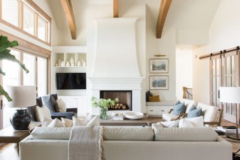
White Dove – Benjamin Moore
Yes, tried and true and a little old school. Can’t beat it, for a warm, but not too warm color for walls cabinetry, ceiling and trim. This color sings on cabinetry, so go to town on your kitchen cabinets or vanity. It’s timeless and soft on the eyes and pairs with just about any color. It can skew a bit yellow if you put a stark white next to it, so be cautious if you have white appliances or other finishes like marble/stone or tiles that are cooler white do a comparison in different lights to try to catch the undertone differences before you commit.
In many cases, the different whites will be OK together, just realize your own sensitivity to the differences – remember if you’re staring it down for days, you may just be over-analyzing and take a break for a week…kind of like sniffing the coffee beans between perfumes.
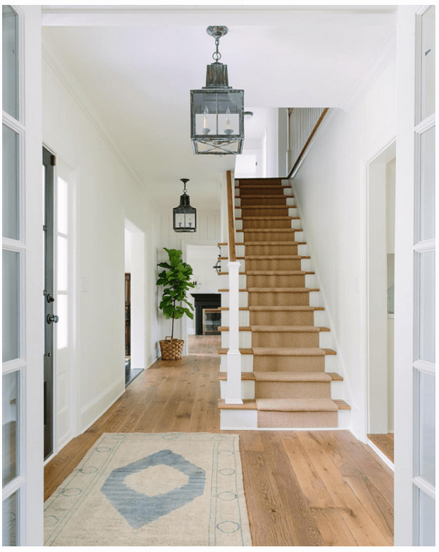
Light direction from your windows and doors will affect your white paint. Southern exposure will always “warm” paint color and make it look more yellow/orange. Rule of thumb is to use multiple sample boards or large swatches of paint on every wall and examine them at different times of the day and on sunny and overcast days..take pictures so you have a catalogue to reference.
Chantilly Lace – Benjamin Moore
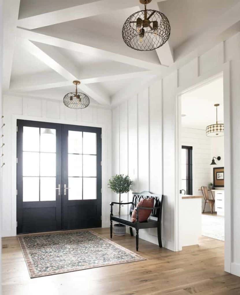
This white paint color has more recently caught my attention because of it’s apparent lack of major undertone. I was coordinating a custom wallpaper treatment and looking for the perfect white to match the background, and voila Chantilly Lace. It straddles the cool white/warm white spectrum and gives a nice clean look without the starkness of some more pure cool whites. I also found that it worked with the other white tones in the space, and there were many – it was a bathroom, so you’ve got to figure in the white of the vanity, the tub and other tiles that were not being replaced – this was a refresh remodel so we were trying to preserve and reuse as many finishes in the room.
Painting Cabinets? TIP: Keep handles and hinges with each door (label them together so it’s much easier to piece the cabinets back together). Thoroughly scrub/clean the cabinets with degreaser, lightly sand with around 240 grit sandpaper and don’t forget to PRIME first before you paint. You can even tint your primer if you are going darker with the final white paint color.
Swiss Coffee – Benjamin Moore
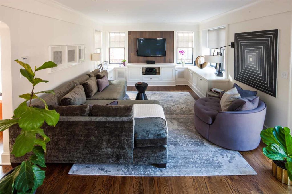
Now I’m not a coffee drinker, but how can you resist a name like this? It conjures up the swirling creamy goodness on top of the coffee (which I could drink an entire cup of) after the barista drops the froth in. This is a soft creamy white – no doubt about it, if you’re not a warm white person (which I think you get this is where this post is focusing right?) this is not the right white for you. This color came to my attention when matching walls to some existing White Dove trim – which had been in the home for a number of years.
I needed a color to play off of the warm tones in the trim without too much contrast. I can tell you I had at least 30 swatches up in all light to test the undertones and reflectiveness of each color. Swiss Coffee was the winner and has been in many homes since. As I tend to decorate with a mix of rich earthy warm tones this is an excellent backdrop – but it also works in more modern architecture if again, stark whites don’t make you feel so cool. 😉 In some light it has a touch of a green undertone – which I’m partial to, I always prefer that subtle green, especially grey-greens (I love olive greens, moss, avocado, eucalyptus) keep that in mind when you’re decorating.
Vanilla Milkshake & White Heron – Benjamin Moore
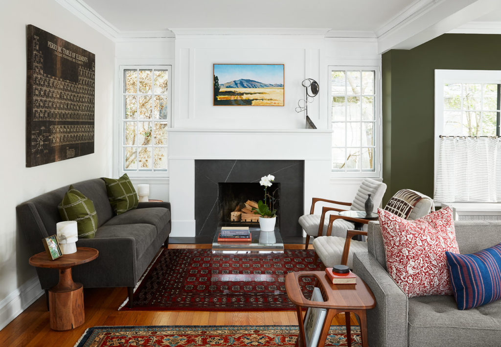
These two are my go-tos when I need a cooler crisp white for trim. Yes, Decorators White is always the front-runner, but I just like to find my own unique options. White Heron is a cooler, white when you need something that will shy away from getting dingy or muddling with other colors. It has a subtle bluish undertone as many of the cooler whites do, but it has sophistication and clarity that has its purpose. Vanilla Milkshake you’ll find on the same card in the Ben Moore fan deck, but just a little ways down into a touch grey. It softens things up just a hair, and is a great alternative from White Dove if you’re just White Doved out.
TIP: Choose your paint product and finish wisely! Coverage, quality and washability are all factors you need to take into account when buying your paint. Benjamin Moore for example has builder-grade Spec paint all the way up to their top tier Aura white paint. There are also speciality paints like their Aura Bath & Spa, Natura and Advance products which are used for different applications. Finishes like eggshell are best for high traffic areas, but there are new washable matte paints that give more drama and depth for spaces that call for it. For trim, I prefer a Satin finish from the traditional Semi-Gloss, but not all colors come in all finishes. Ceiling paint you typically do a Flat.
Cloud White – Benjamin Moore
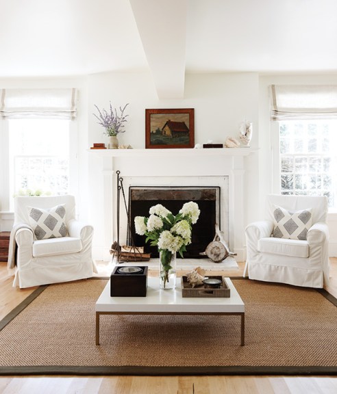
Another excellent warm white that I love to use mostly for ceilings but is versatile enough for cabinetry, walls and trim. It again holds space between the warmer whites and the cooler whites to give a subtle glow, but neutral enough to blend with anything you throw at it.
School House White – Farrow & Ball
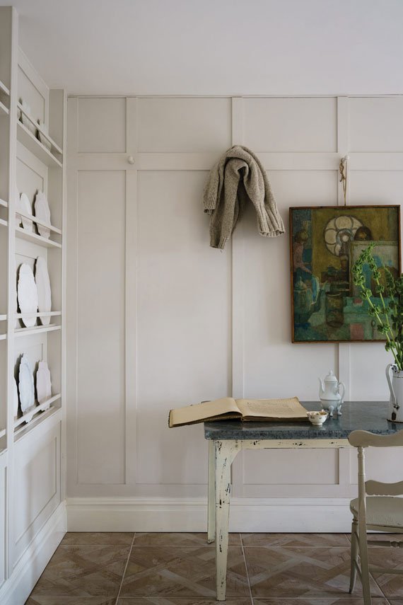
A relatively new white in the market from F&B, this white seems to have been added to the lineup to fill the soft-white neutral void. I generally love their colors for the their depth and complexity and this white seems to hit it out of the park. It is slightly more tonal than White Dove, but has a warm undertone and a touch more grey for a little added patina. Go to town with this on your cabinetry, walls, trim and ceiling, or pick just one and revel in the artistry that is F&B.
Shaded White – Farrow & Ball
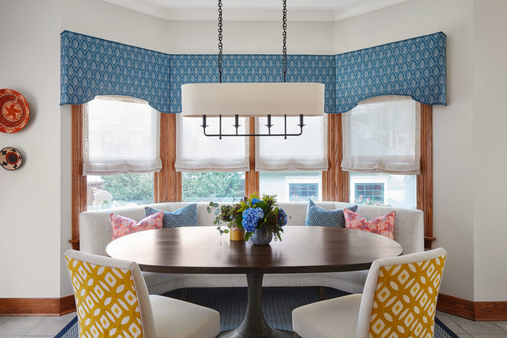
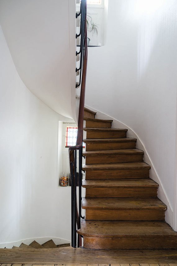
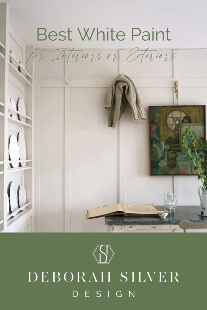
Want to go a little deeper? This off-white is a stunner. It has subtle tones of grey, but don’t be mistaken, it is not grey. It can meld with the old and new, bridging a transitional space to elevated glory. It’s the kind of color you spot in the nook that you wish you could capture – and there it is in a paint color. Where some of these mid-blends can get muddy, this hue has a natural under-glow that makes other colors that surround it sing. I’ve recently used this color in one of my Historical home projects, my client wanted some updated details but had worked so hard to preserve the beauty of this rich property. The pictures here show it all.
What to ask a painter before hiring – TIP: What quality paint is included in their quote? How many coats of white paint will they be applying? What type of preparation will they do before painting, and how will they protect your space?
Pointing – Farrow & Ball
If more saturated colors are your jam – Pointing is an excellent counterpart to set off the deeper tones those selections. This one has a slight red undertone, and runs only the tiniest bit warm, so it complements colors with more depth and strength really nicely, a great choice for trim and ceiling. It has the reach of being a solid choice for kitchen cabinets as well if you want a touch of warmth without going to yellow, of if you have darker stained wood floors.
Eider White – Sherwin Williams

You’re looking for an exterior white – maybe just for trim or, you’re possibly on the modern farmhouse train…you can steer clear of the glaring white with this wonderful more subtle white from Sherwin Williams. I’ve always been drawn to it, and it complements many other exterior color choices. You can easily paint the entire house, or just the trim and make a statement.
Do you need advice on best paint colors, want to know what works in your space or have a project starting? Get unfiltered advice, recommendations and a preliminary design plan to help you get past indecision or overwhelm here – book a consultation call!

Add a comment
0